Examples of John Robert Wiltgen Design kitchens and baths took center stage recently when officials of The Merchandise Mart asked yours truly to lecture at the October 2000 National Kitchen and Bath Month celebration. At the event, sponsored by House Beautiful, I was invited to present an insider’s view of current trends seen in the heart and soul of our homes.
Here are some of the design concepts we zeroed in on…

We created a bathroom to look as though it had always been in a historic Beaux Arts building opened on the corner of State Parkway and North Avenue in 1913. In a recent renovation, the penthouse master bath (for the lady of the house), was the epitome of understated opulence. The combination of polished and honed stone surfaces gave the space warmth and depth. A hand cut mosaic surrounding the Whirlpool tub (with gold plated jets and spout) and separate steam shower introduce luxurious amenities. An ample walk-in closet, built-in dresser and dressing table provide über convenience.

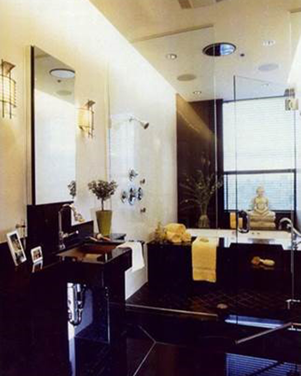
For those who love the look of classic modern, wonderful new products are being introduced every day. We combined Kohler’s sculptural stainless steel vessel with a wall mounted faucet for a sophisticated vibe in a newly constructed loft at Metropolitan Place (the former Florsheim Shoe factory). Eliminating a shower paved the way for a strong and very dynamic looking floating granite countertop. The shelving was designed especially for the client’s objets d’art.

Often, when we are asked to consult on a project nothing may exist. In this case, the condominium was purchased as raw space. It was a duplex and sold as a three bedroom home. But our clients’ priority was a real kitchen, not three bedrooms they didn’t need. So, we sculpted an improved kitchen from a former guest bedroom which made the living and dining areas much more gracious as well. Professional-style stainless steel appliances and abundant storage allow the kitchen to perform for its savvy owners. The breakfast table is centered on a window to maximize the bustling city view below.

No doubt about it, when a room is designed well, it will never go out of style or appear dated. While this bath was done 14 years ago, I always like to talk about it as if it were something new. Nestled deep within a large home (17,000 square feet) in Barrington Hills, green and ivory striped marble walls, accented with 24k gold trim, will look timeless even 20 or 30 years from now. Just F.Y.I., I prefer robe hooks for bathroom towels as opposed to towel bar. Then you needn’t worry about towels being perfectly folded when you are done using them!

Talk about a kitchen being a labor of love. I shed my suit coat, rolled up my shirt sleeves and went to work with our painters to achieve the desired effect. The cherry cabinets were first seared with a branding iron, then hand-rubbed with gold dust. Tumbled marble floors and slate countertops imported from England completed the project. Good lighting is important everywhere, especially in the kitchen. Here we used lights installed on the top of the wall hung cabinets to cast a soft glow on the ceilings which we glazed to look as old as the Benjamin Marshall classic building in which it is located.

We converted a small sitting room adjacent to the master bedroom to “his” bath – a luxurious space with a walk-through shower in front of the tub. But really, what is this bath all about? Natural daylight. As we continue to spend more time and money in and on bathrooms, they are moving out of the innards of a home and making their way toward the windows. If you are lucky enough to have a view, why not luxuriate in it? Then complete the ensuite setting with a linen closet, outfitted with a microwave, coffee maker and under counter refrigerator conveniently catering to today’s “bespoke” lifestyle.

Because our firm’s philosophy calls for “the integration of art, architecture, and design,” we used an important Henry Moore drawing to compliment a stone torso in a loft’s kitchen. The setting is within space that has been visually transformed into an Egyptian temple. This urban residence represents a classic example of unusual ways a designer effectively packages materials and elements from diverse periods and styles to create a one-of-a-kind interior.
These were just a few of the highlights from the presentation I provided to more than 500 guests at the Mart. At the end of the day, having a fabulous looking kitchen and/or bath is simply not enough. They have to work for you as well. Remember, good design doesn’t cost – it pays!
